

As always, our developers have been hard at work improving LACRM, and the theme this week has been "user experience polish". Not much changed functionally, but a number of things just got easier to use...
Collapsible sidebar
One of the biggest changes with the new design we're in the process of rolling out is that the navigation has moved from the top of the screen to the left side. This should be a major improvement for mobile and tablet users because it allows the navigation to work the same on mobile as it does on desktop. It also is an improvement for people using computers with large screens because it puts more information on the screen at once without cluttering up the main page content.
However, it posed a bit of a problem for people with small laptop screens. The menus on the left side could take up a significant amount of screen space which meant less room for the main page content. A number of our customers wrote in with that feedback, and I'm excited to announce that we just added the ability to collapse the sidebars on the left so they'll take up significantly less space!

After you collapse the sidebars, they'll still show up, but they'll take up significantly less space. To see the full menus, just move your mouse over them and they'll expand to show all your options.
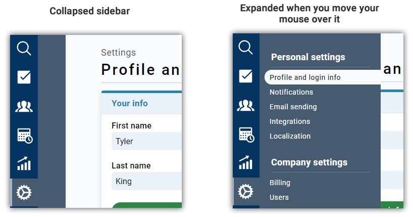
We still recommend that most people keep the menus expanded, but if you have a really small computer screen, this can be a good way to make more space for the main content.
High contrast mode
When designing software, there's often a trade-off between aesthetics and accessibility. For example, text is easiest to read if it has high contrast (e.g. pure black text on a pure white background) but it can be more attractive to use different colors and shades. We try to strike the right balance with our design, but some of our users have trouble reading text on a computer screen, and they'd prefer to have the highest contrast possible, even if it means that the app won't be as aesthetically pleasing. That's why we built "high contrast mode" which is a slightly tweaked style that we can apply to your CRM to make the text as easy to read as possible. It ain't pretty, but it's functional.
If you have trouble reading the text in LACRM, feel free to reach out and request that high contrast mode be applied to your account.
Redesigned user management
If you're an admin on an account with multiple users, you probably had to figure out the User Management settings page at one point. The old design was perfectly functional, but to be honest, it could get a bit confusing, especially as you added more users. User permissions are a complicated topic, so that's somewhat unavoidable, but we just released some updates to that page that make it more streamlined and easier to understand. Nothing about the underlying functionality has changed, it's just hopefully a bit easier for everyone to understand.

That's it for now! We hope you enjoy these changes, and as always, we've got tons of other great improvements in the works, so stay tuned!
Sign up to receive updates in your inbox